
Graduation Project PowerPoint Design with Content and Results
Graduation project PowerPoint design with organized content, clear results, objectives, implementation, and polished academic flow for university review.

A graduation project PowerPoint design with organized content and results requires understanding the project before thinking about colors and templates because a strong presentation should show the committee what problem the students worked on, how the proposed solution was implemented, what results were achieved, and what real value the project added. A common mistake is copying the graduation report chapters into slides in the same order, creating a crowded presentation that consumes most of the available time before reaching the important parts. A better approach is to build a clear story beginning with the problem and the need for the project, followed by objectives, implementation, the final product or prototype, results, testing, and key recommendations. Every slide should have a clear reason for appearing in the sequence so a committee member can understand the project even without reading the complete report.
Graduation Project PowerPoint Design

Graduation project PowerPoint design should begin with one simple question: what does the committee need to understand in order to evaluate the project within the available presentation time? The answer is usually not everything contained in the written report. A graduation project report may contain dozens of pages of definitions, references, background information, and technical detail, while the presentation only needs the elements that explain the logic of the project and demonstrate that the team understands what it did and why.
A strong opening identifies the problem or need that led to the project. If the project is a university application, for example, the presentation should not begin with a long history of mobile applications. It should explain the actual problem, who is affected by it, and why the team believed a solution was needed. Objectives then follow naturally because the committee needs to understand what the team intended to achieve before seeing the results.
The presentation should then introduce the solution itself. This should not be a general theoretical description. It should explain what was actually developed, designed, analyzed, tested, or implemented. Whether the project is a system, platform, device, prototype, campaign, or applied study, the slide should make the final output understandable.
Implementation comes next. The main stages should be shown without listing every minor task. If several students worked on the project, the presentation should reflect the actual distribution of responsibilities rather than giving each person an equal number of slides regardless of their role.
Design should always support the content. Every slide does not need a large image or ten icons. If a table, diagram, screenshot, or prototype image communicates the idea faster, it should be used. If simple wording is clearer, the slide should remain simple.
One of the most common weaknesses in graduation presentations is spending half the time on theoretical background and then rushing through the results. The committee is usually more interested in what the team actually produced and how it was tested than in hearing lengthy definitions already included in the written report.
-
Every slide should contribute information that helps the committee understand or evaluate the project rather than appearing only because the selected template has a placeholder for it
-
The largest share of presentation time should usually be given to the solution implementation and results because these sections distinguish the team’s actual work from general information available in references
-
Images diagrams screenshots and prototypes should be used when they explain the team’s work more clearly and should not become visual decoration that hides weak content
Graduation Project Presentation
A graduation project presentation needs a sequence that allows the committee to follow the team step by step without stopping midway and wondering what the original objective was. A presentation that explains implementation before defining the problem or shows results before introducing the evaluation indicators can be confusing even when the underlying project is strong.
The presentation usually begins with the project title, team members, and supervisor, then moves directly into the problem or need. The target users, beneficiaries, or operational context can then be introduced. Objectives should follow because they determine what the team will later measure when discussing outcomes.
The proposed solution comes next in a concise form. If several alternatives were considered, it may be useful to explain briefly why the final solution was selected rather than spending several slides reviewing every rejected option. The presentation then moves into implementation stages, tools, technologies, or resources before presenting testing and evaluation.
For applied projects, showing the final version or prototype is extremely important. A well-organized screenshot, photo of the device, or workflow diagram is often stronger than three descriptive slides. If the team plans to demonstrate the system live, it should know exactly what will be shown and should have a backup plan in case of technical failure.
Research-based or analytical graduation projects require a different emphasis. More presentation time may be needed for methodology, data, and findings. A software-project template should not simply be reused for a social research project because every type of project has its own logic.
From a persuasive perspective, the project’s value should be presented without exaggeration. If the project is a prototype, call it a prototype. If it was tested on a limited sample, say so clearly. It should not be described as a market-ready product unless it has actually reached that stage.
Each team member should also know exactly when to take over from the previous speaker. Abrupt transitions between presenters can make a strong project feel fragmented even when the slides themselves are connected.
-
The presentation sequence should move from the problem to the objective then the solution implementation and final results so every stage has a clear reason for appearing
-
Any live demonstration should be prepared in advance with backup screenshots or a short recorded demonstration so the presentation does not depend entirely on an internet connection or one device
-
Each team member should present the section they genuinely understand and should also know how that section connects with the rest of the project rather than simply receiving an equal number of slides
Organizing Graduation Project Slides
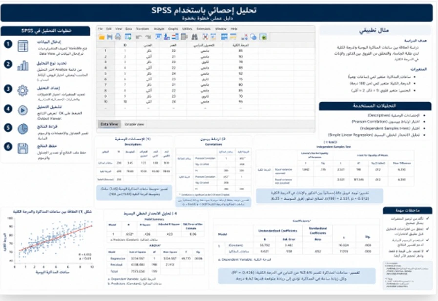
Organizing graduation project slides requires building a story instead of following the written report chapter by chapter. The report is designed for documentation and detail while the presentation is designed for fast understanding and evaluation. A theoretical chapter that occupies many pages in the report may need only one slide if its purpose is simply to explain the gap or need that made the project necessary.
A practical sequence begins with the title slide followed by a concise explanation of the problem. The objectives then appear, followed by project scope and the most important limitations so the committee understands what the project includes and what lies outside its boundaries. The proposed design or solution can then be introduced, followed by methodology or implementation stages.
For a technical project, the next slides may show architecture, components, key interfaces, or major functions. For an engineering project, they may show the design, physical components, and testing procedures. For a research project, they may show the instrument, sample, and analytical process.
The presentation should then move to results. Results should not be pushed into the final minute because they are often one of the most important parts of the evaluation. They need enough time for the team to explain not only what happened but also what the findings mean.
Challenges and limitations can then be discussed professionally. Mentioning that time, data, or resources were limited does not automatically weaken the project when the team explains how these constraints were managed and how they affected the outcome.
The presentation should then end with conclusions, recommendations, or future development. It is important to separate what the team actually implemented from what it proposes for future work so the committee can clearly distinguish the completed project from future ideas.
Additional slides containing technical details, full tables, or extra images can be placed after the final slide and used only during questions.
-
Slide order should follow the logic of understanding the project rather than the numbering of report chapters because a written report and an oral evaluation require different information paths
-
Results should receive a clear section before the conclusion and should not be delayed until the end of the allocated time where the team may be forced to rush through them
-
Future-development slides should clearly distinguish between features already implemented and features that remain proposals so the project does not appear larger than its actual achievement
Formatting Graduation Project Results
Formatting graduation project results depends on the nature of the result itself. Not every result needs a table and not every table needs to become a chart. The first step is deciding what message the committee should understand from each result.
If the project is an application or system, results may include response speed, task-completion rates, usability, performance, or the number of functions successfully implemented. A before-and-after comparison table or a simple chart may help communicate these outcomes.
If the project is an engineering device or prototype, results may involve testing accuracy, efficiency, durability, or resource consumption. In that case, it can be useful to show the target value and actual value where those figures are part of the evaluation.
If the project is research-based, the results should be connected directly to the research questions or hypotheses. The question can be shown first followed by the relevant result instead of presenting several tables in sequence without explanation.
Visual presentation should remain honest. If the difference between two values is small, the axis should not be manipulated to make that difference appear dramatic. Committees can quickly notice misleading visual design, and it can damage confidence in the team’s handling of data.
A result that did not meet the team’s expectation should not automatically be hidden. A failed experiment or an indicator that did not improve as expected can become an important learning point. A team that can explain the outcome and its limitations often demonstrates greater understanding than a team that tries to avoid discussing it.
Every figure in the presentation should also be checked against the final report. One incorrect number in the slides can raise questions about the reliability of all the other results even if the rest of the work is accurate.
-
Every result should appear with enough context to explain what was measured and why the indicator matters to the project rather than presenting figures without meaning
-
Tables and charts should be selected for clarity and truthful presentation of the data rather than because they make the slide appear more visually sophisticated
-
Results that do not support the original expectation should still be presented with a reasonable explanation and clear limitations because they remain part of the project evaluation
Graduation Presentation Design for University
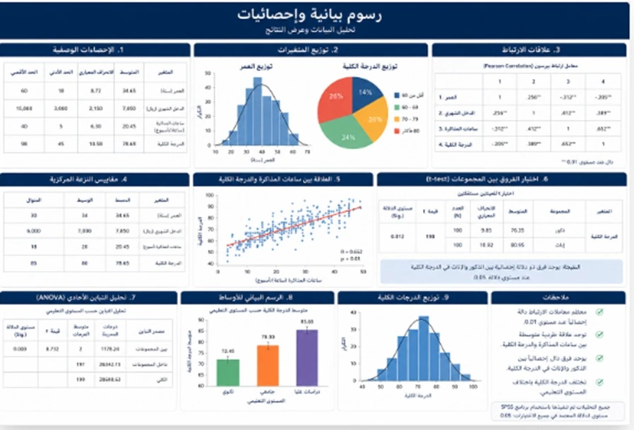
A graduation presentation design for university should balance the university identity with the identity of the project itself. The logo does not need to appear in an oversized form on every slide, and the presentation should not move so far away from academic visual conventions that it looks like a marketing campaign. The strongest approach is usually a clear and restrained visual identity that gives most of the space to the project content.
The opening slide usually includes the project title, student names, supervisor, department, college, and university according to the applicable requirements. Every name should be checked carefully because a spelling mistake in the name of a team member or supervisor creates an unnecessarily poor first impression.
The rest of the deck should follow one consistent system for headings, fonts, colors, and spacing. Constant changes in layout make the presentation look like several unrelated files assembled at the last minute.
This is especially important in team projects because each student may have designed their own section differently. One person may use long text, another may depend on images, and another may use a different color palette. Before the final presentation, all sections should be unified into one visual system.
Department instructions should also be confirmed before design begins. Some programs provide a template, time limit, or list of mandatory sections. These instructions should take priority over general design preferences.
If the presentation is in Arabic, right-to-left direction should remain consistent in headings, tables, and lists. If technical terminology appears in another language, it can be used where needed without turning every line into a confusing mixture of directions.
-
The university identity should appear in a balanced way that keeps the project itself at the center of the presentation rather than allowing branding elements to dominate the slides
-
Slides created by different team members should go through one final visual review so the project appears to be one coordinated team effort rather than several separate presentations
-
College and department requirements should be confirmed before design work begins because an official template presentation duration or required structure should take priority over visual preferences
Summarizing a Graduation Project for Presentation
Summarizing a graduation project for presentation means removing repetition without removing meaning. Many students hear the word “summary” and delete important detail until only vague statements remain such as “the project aims to improve the service” without explaining what improvement means or who benefits from it.
A good presentation summary preserves four things: the problem, the decision, the method, and the result. Every paragraph in the report can be tested against one question: does the audience need this information to understand one of those four elements? If not, it may belong in the written report rather than the presentation.
In the background section, two or three essential points are usually stronger than ten references. In the methodology, the main stages matter more than every small procedural detail. In the results, the indicators that directly answer the objectives should receive priority.
Details likely to be raised by the committee can remain in speaker notes or backup slides. This allows the main presentation to stay clean while keeping the team prepared for questions.
A common mistake is copying text from the report and simply reducing the font size instead of summarizing it. If the text still requires a very small font to fit on the slide, the problem is usually the amount of content rather than the typography.
For technically complex projects, a paragraph can often be replaced with a simple diagram showing relationships among system components. The diagram, however, should be understandable immediately and not require another paragraph to explain it.
-
Summarization should preserve the problem decision implementation and result even when much of the theoretical background is removed
-
Text that requires a very small font to fit on the slide should be rewritten divided or simplified instead of reducing the font and forcing the committee to struggle with reading
-
Important details likely to be discussed during questions should move into backup slides so the main presentation remains concise without reducing the team’s preparedness
Project Objectives and Results Slides
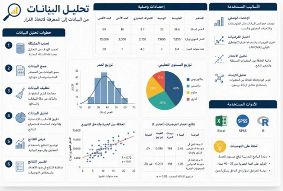
Project objectives and results slides should be connected directly to each other. If an objective says that the project aims to reduce the time required to complete a task, the result should show whether that time actually decreased and by how much. If the objective is to improve accuracy, the presentation should include an indicator demonstrating accuracy before and after implementation or against a clearly defined benchmark.
A common problem is writing objectives in very general language while presenting results as a separate collection of figures. A strong solution is for the team to create an internal table before designing the slides that connects every objective with its measurement indicator, result, and supporting evidence.
An objective does not need to appear as a long sentence on the slide. It can be visually shortened as long as its meaning remains accurate. The related result can then be shown through a number, chart, screenshot, or prototype image depending on the nature of the project.
If some objectives were not completed because of time or technical limitations, this should be stated rather than presenting them as fully achieved. The committee is likely to ask about them anyway.
The team should also distinguish between an output and an outcome. Building an application is an output. Showing that users completed a task successfully at a certain rate is an outcome. Creating a prototype is an output. Demonstrating an improvement in a defined performance measure is an outcome. This distinction helps show that the team understands how to evaluate its own project.
-
Every objective should be connected to a clear indicator or piece of evidence so the committee can see whether it was fully achieved partially achieved or not completed
-
The final output should not be presented as though it were automatically an evaluation result because creating a system and measuring its success are two different things
-
Objectives that remain incomplete should be presented honestly with a clear reason and future-development plan rather than hidden behind broad wording
PowerPoint for University Student Projects
A PowerPoint for university student projects varies more by discipline than by designer preference. A software project needs interface screenshots, system architecture, workflow, and user testing. An engineering project needs design specifications, components, tests, and performance results. A business project may need market analysis, a business model, and study findings. A health-related project may require stronger attention to methodology, data handling, and specialist terminology.
This is why one template marketed as suitable for every graduation project often forces very different content into the same unsuitable structure. A stronger approach is to use a flexible visual system that maintains consistency while changing how information is presented according to the project type.
For group projects, the contribution of the team should be visible without turning the presentation into a collection of individual reports. Task distribution can be shown in one slide if required or demonstrated naturally through the presentation roles.
The presentation should also reflect the final version of the project. If a feature or result changes two days before the defense, the slides should be updated accordingly. An old screenshot or outdated figure can create confusion and embarrassment.
During rehearsal, every student should listen to and understand the sections presented by the other team members rather than memorizing only their own part because the committee may direct any question to any team member.
-
The project template should change according to the discipline and type of output because the visual needs of an application are different from those of a financial analysis or engineering experiment
-
Every team member should understand the complete project even when presentation roles are divided because the committee may ask any student about any essential part
-
The final slide deck should be checked against both the project and written report before the defense so no outdated content remains from an earlier version
Organizing Graduation Presentation Content

Organizing graduation presentation content depends on priority and time. If the team has fifteen minutes, it does not make sense to give every member exactly five minutes simply for the sake of equality if the results section deserves more time than the introduction.
Time should be distributed according to the importance of the content. The presentation can begin with a short explanation of the problem, then move through the objectives, devote the largest portion to implementation and results, and finish with a concise conclusion.
Clear transitions should connect each section. After the problem, the speaker may explain that this need led to the following objectives. After methodology or implementation, the team can explain that these procedures produced the following results. Simple transition sentences make the presentation feel connected.
Each slide should also have one main idea. A slide containing the problem, objective, method, and result at the same time usually loses its focus.
Challenges do not necessarily need to be saved for one apologetic slide at the end. A challenge can be mentioned where it affected an implementation decision or result so the committee understands its actual impact.
Speaker notes can be extremely useful. They can contain the detail the student needs to explain while the screen remains concise and easy to follow.
-
Presentation time should be distributed according to the importance of each section in project evaluation rather than according to the number of team members or chapters in the written report
-
Transitions between slides should explain how each stage leads to the next so the presentation does not feel like a collection of unrelated topics
-
Speaker notes can contain the detail needed for verbal explanation while the visible slide remains concise and comfortable for the committee to read
Professional University Project Presentation
A professional university project presentation means that the team can explain the problem, solution, and results confidently while demonstrating that visual design supports the idea rather than covering weaknesses. Professionalism does not mean excessive animation or complicated fonts. It appears in accurate content, consistent identity, readability, and control of presentation time.
Rehearsal is one of the most important stages before the final presentation. Each member should practice their own part first and then the full team should rehearse the presentation from beginning to end under realistic timing. This is where problems with transitions, repetition, and overly long slides become obvious.
If there is a live demonstration, it should be tested on the same device or in a similar environment beforehand. The team should also prepare screenshots or a short backup recording in case the system fails during the presentation.
The team should anticipate questions such as: Why did you choose this solution? Why did you use this tool? How did you verify the result? What are the project limitations? What could be developed in the future?
The strongest answer is not a memorized sentence. It should be connected to a real project decision and supported by the team’s actual work.
A professional presentation also does not hide weaknesses. If the prototype does not support a certain function, the team can state that it lies outside the current scope or forms part of future development instead of pretending the feature already exists.
-
Professionalism appears in control of time understanding of the project and the ability to explain decisions more than in the selected template or visual effects
-
A live demonstration should always have a prepared backup so a small technical failure does not eliminate the strongest part of the presentation
-
Project limitations should be stated clearly because understanding what was not implemented gives the committee a more accurate picture of the team’s maturity and scope management
Conclusion
A graduation project PowerPoint design with organized content and results succeeds when a long written report is transformed into a clear story that begins with the problem, explains the objective, presents the solution and implementation, and then communicates the results honestly and clearly. The goal is not to compress every page of the report into small slides or create a presentation full of effects.
Strong organization gives implementation and results the largest share of attention because these sections demonstrate the team’s actual work. Strong design allows tables, charts, screenshots, and images to support the explanation rather than distract the committee.
A team presentation also requires greater coordination because differences in style among members can make the project appear fragmented. The final deck should therefore use one visual system, consistent terminology, coordinated language, and full-team rehearsal.
Most importantly, the presentation should remain faithful to the actual project. The team should not exaggerate a result, add a feature that was not completed, or describe a prototype as a fully finished product if it has not reached that stage.
A strong presentation should allow the committee to answer five questions easily after the final slide: What was the problem? What was the project objective? How was it implemented? What was the result? What value did the team add?
Frequently Asked Questions
How many slides should a graduation project PowerPoint contain?
There is no fixed number because the appropriate slide count depends on presentation time and project type. The team should confirm the available time first and then build the slide count around the content that needs to be evaluated.
What are the most important parts of a graduation project presentation?
A typical presentation includes the problem, objectives, proposed solution, implementation, results, conclusion, and future development.
Should the introduction be long?
No. It should provide enough context for the committee to understand the problem without repeating all the theoretical background included in the written report.
Should all project objectives appear?
The main objectives used to evaluate the project should be shown clearly and directly.
How should the project methodology be presented?
Show the main stages, tools, and important decisions through a simple process diagram or concise points instead of describing every minor step.
Should all implementation details be included?
No. Details that are not essential to the main presentation can remain in the written report or backup slides.
How should a software project be presented?
Focus on the problem, system architecture, core functions, important interfaces, testing, and results rather than showing every screen in the application.
How should an engineering project be presented?
Explain the design requirements, components, implementation stages, testing process, results, and final performance.
How should a research-based graduation project be presented?
Focus on the research problem, questions, methodology, sample, instrument, analysis, findings, and discussion.
Are charts required?
Only when they communicate a pattern or comparison more clearly than a table.
Should every results table be included?
No. Select the tables directly connected to project objectives and keep additional details in backup slides.
How do we connect objectives with results?
Connect every objective with an indicator or evidence showing whether it was fully achieved, partially achieved, or not achieved.
What is the difference between an output and a result?
An output is what the team produced, such as an application or prototype, while a result measures how successful or effective that output was.
Should an unexpected result be presented?
Yes if it is part of the project because it may become an important point during discussion.
Should incomplete objectives be hidden?
No. It is better to state them clearly with the reason and a future-development plan.
Should all team members be listed on the first slide?
Usually yes, together with the supervisor, according to department requirements.
Does every team member need to present the same number of slides?
Not necessarily. Presentation responsibilities should reflect the members’ roles and the nature of the project sections.
Can the committee ask a student about a section they did not present?
Yes. Every team member should therefore understand the full project.
Should the university logo appear on every slide?
That depends on university instructions and any official template. Where it is not mandatory, the university identity can be used in a balanced way.
What colors are best for a graduation presentation?
A limited and consistent color palette with strong readability and contrast is usually better than using many colors.
Is small text a problem?
Yes. The committee should be able to read the slides from a distance, and presentation slides are not designed for close reading like a written report.
How can we tell if a slide is overcrowded?
If you need to reduce the font significantly or explain to the committee where to look, the slide probably needs to be divided or simplified.
Should paragraphs be copied from the report?
It is better to convert them into concise points, diagrams, or short messages rather than copying them in full.
Should we use many images?
Use images that explain the prototype, results, implementation, or process rather than images added only for decoration.
Should we use animations and transitions?
Use them lightly where they support sequencing because excessive effects can distract the committee and create unnecessary technical risk.
What should appear on the results slide?
Present the most important indicators linked directly to the project objectives together with a brief explanation of what they mean.
How should we present a before-and-after comparison?
A simple table or clear chart can be used as long as the actual values are preserved and the visual design does not exaggerate the difference.
Should we include a challenges slide?
Yes where the challenges affected implementation or results, and it is useful to explain how the team responded to them.
Should future development be included?
Yes, but it should be clearly identified as future work rather than something already implemented.
Should references be included?
A concise citation should be included where important external data or information is used, while the full reference list remains in the report.
Should the presentation follow the same order as the written report?
No. The presentation should organize information for fast understanding and evaluation, while the written report follows a broader documentation structure.
How can we shorten the report without losing important content?
Keep the problem, objectives, major decisions, implementation, and results while moving secondary details into backup slides.
Should backup slides be prepared?
Yes, especially for complete tables, technical details, testing information, and likely committee questions.
Where should backup slides be placed?
Place them after the main presentation so they remain accessible during discussion without consuming the formal presentation time.
Is a live demonstration necessary?
It can be very useful where the demonstration is one of the strongest parts of the project, but a backup such as screenshots or a recording should always be prepared.
How should we prepare for committee questions?
Review why the project idea, tools, methodology, results, limitations, and future-development choices were made.
Should the presentation script be memorized word for word?
It is better to understand the points and rehearse them naturally because a memorized script can become difficult to recover if a question or interruption changes the sequence.
Should the entire team rehearse together?
Yes. Full-team rehearsal reveals repetition, timing problems, and weak transitions between speakers.
What should we do if the presentation is longer than the available time?
Remove repetition and lower-priority theoretical detail rather than cutting implementation and results so heavily that the project becomes difficult to understand.
What makes a graduation project presentation professional?
It should be organized, concise, readable, consistent with the written report, and focused on the team’s actual work and results without exaggeration.
Is PowerPoint design more important than project content?
No. Good design supports understanding, but the project itself, the quality of the work, and the team’s ability to explain it remain the foundation.
How do we choose a graduation project PowerPoint design service?
Choose a service that first understands the project, specialization, presentation time, and university instructions and then builds the slides around the problem, implementation, and results instead of using one generic template for every project.
What should we send the designer before work begins?
Send the final report, presentation duration, university or department instructions, team and supervisor names, the approved university logo, and any screenshots, results, prototypes, or project visuals that need to appear in the presentation.
Need Help?
Contact us directly via WhatsApp and we will reply as soon as possible.
More Articles
Urgent PowerPoint Design in 24 Hours for University or Work
Urgent PowerPoint design within 24 hours for university or work, with clear structure, polished slides, accurate content, and presentation-ready delivery.
Read Article → Scientific ResearchTurning Scientific Research into a Concise Defense PowerPoint
Scientific research into a concise defense PowerPoint with clear structure, methodology, results, conclusions, and polished academic presentation slides.
Read Article → Statistical AnalysisPowerPoint Design Prices in Saudi Arabia by Slide Count
PowerPoint design prices in Saudi Arabia by slide count, with key cost factors, custom design options, and clear guidance to choose the right service.
Read Article →