
Turning Scientific Research into a Concise Defense PowerPoint
Scientific research into a concise defense PowerPoint with clear structure, methodology, results, conclusions, and polished academic presentation slides.

Turning scientific research into a concise PowerPoint presentation for a defense requires more than deleting pages and distributing what remains across slides because a research paper or thesis is written for complete documentation while a presentation is designed to explain the logic of the study quickly. The goal is to preserve the essential scientific sequence: What is the problem? What is the research question? How was the study conducted? What results were found? What do those results mean? What limitations prevent excessive generalization? Successful summarization is therefore not measured by the number of words removed but by whether the complete research argument remains intact despite the reduction. The difference between an organized presentation and an overcrowded one begins with an early decision about what information must appear on the screen, what the researcher should explain verbally, and what should remain in the thesis for reference during questions.
Converting Scientific Research into PowerPoint

The process of converting scientific research into PowerPoint should begin by reading the research as one complete system before opening the presentation software. A common mistake is for the researcher to start with the first chapter, take the first paragraph, place it on a slide, and then continue in the same way until the end of the thesis. The result is a long presentation that looks like a document divided into small pages rather than a clear explanation of the study.
A stronger approach is to create a content map. Write the research problem in one sentence, then list the questions or hypotheses, the most important methodological decision, the findings connected to each question, and the final conclusion. If this structure cannot be written clearly and concisely, the real problem is not PowerPoint design. It means the logic of the research has not yet been fully broken down and understood.
The next step is to divide the information into three levels. The first level must appear in the presentation because it is essential for understanding the research, such as the problem, objectives, methodology, and findings. The second level can appear briefly or be explained verbally, such as some details about why particular instruments were selected. The third level remains in the thesis or backup slides, including extended tables and procedural details that are not necessary for understanding the primary finding.
Consider a research project containing thirty pages of previous studies. The presentation should not convert every study into a separate bullet point. Instead, it should identify the pattern that supports the current research. Previous studies may have found a relationship in certain contexts but may not have examined the particular population addressed by the current study. One slide can then perform the function of many pages because it preserves the reason the new study was conducted rather than asking the audience to memorize dozens of researcher names.
The same principle applies to methodology. Instead of copying an entire methodology chapter, identify the study design, sample or participants, research instrument, procedures, and analysis method in a form that allows the committee to understand how the research questions were transformed into data.
The most important test after building the structure is to read the slides without the thesis and ask: Can a specialist understand the logic of the study from beginning to end? If the answer is no, the summarization has probably removed important connections rather than unnecessary detail.
-
Research conversion should begin by extracting the scientific argument before designing any slide so the reduction follows the logic of the study rather than the number of available pages
-
Content should be divided into information that appears on the screen information that is explained verbally and information that remains available for reference so the presentation does not become overloaded with every detail from the thesis
-
Previous studies should be summarized around the main pattern and research gap that led to the current study instead of turning the presentation into a long list of researcher names and publication years
Summarizing Scientific Research for a Presentation
Summarizing scientific research for a presentation is different from writing the abstract that appears at the beginning of a thesis. An academic abstract is written so a reader can read one paragraph or page and gain a complete overview of the study, while a presentation unfolds over time and requires smaller amounts of information to appear at the appropriate moment.
For this reason, the abstract should not simply be copied and divided across three slides. A better approach is to return to the original study and rebuild every part according to its function. The problem appears at the beginning. The methodology appears before the results. A result should not appear before the audience understands what was measured. The conclusion comes after the evidence has been presented.
Good summarization uses importance as its standard rather than chapter length. A theoretical framework chapter may contain fifty pages and require only two slides, while one page of findings may require two slides because it contains the most important discovery in the study.
One useful method is to test every piece of information with three questions: Does it help the audience understand the research question? Does it help them understand the method? Does it help explain the result? If the information does not support any of those purposes, it probably does not need to appear in the main presentation sequence.
However, summarization does not mean removing scientific qualifications and limitations. If a result comes from a specific sample, the sample description should not be removed and the result rewritten as a broad general conclusion. If the analysis demonstrates correlation, it should not be converted into causation simply because causal wording sounds shorter or more powerful.
This is the difference between an academically accurate summary and a promotional summary. Scientific research requires language that reflects the actual strength of the evidence. If the data show an association, the presentation should say association. If the study is exploratory, the presentation should not claim that it has proven a final model.
A simple illustrative slide might say “Higher group mean after the program,” followed by the relevant figure or chart and one short interpretive sentence. There is no need for a five-line paragraph explaining every detail if the researcher will provide that explanation verbally.
-
Summarization should be based on the importance of information within the scientific argument rather than the length of the chapter because long sections may provide background while one short result may represent the core of the study
-
The strength of every claim in the presentation should remain equal to the strength of the evidence in the research so correlation does not become causation and a limited result does not become an unjustified generalization
-
Information that does not help explain the question methodology or result can be moved into notes or backup slides rather than overloading the main presentation
Turning a Thesis into Slides

Turning a thesis into slides requires changing the question from “What should I write?” to “What does the audience need to see at this exact moment?” A thesis allows readers to return to previous pages and reread material, while an oral defense moves forward in real time. Each slide therefore needs to present information that fits the stage the researcher has reached.
A slide explaining the research problem does not need to define the research instrument. A methodology slide does not need to discuss the meaning of a result. When different stages are mixed on one screen, the logical journey of the study becomes difficult to follow.
The first thing to convert is therefore not the text but the structure. A possible sequence might include the study title, focused background, research problem, research gap, questions and objectives, methodology, participants or sample, instrument, analysis, findings, discussion, contribution, limitations, and recommendations.
However, this should not become a rigid template for every type of study. Experimental research may need more space to explain intervention stages. Qualitative research may need to explain coding and the development of themes. Mixed-methods research may need to show how the quantitative and qualitative components were integrated.
After the structure is defined, the researcher decides which visual form best fits each piece of information. Short definitions can remain text. Stages can become a process diagram. Relationships can become a conceptual model. Numerical information may become a comparison or chart. Qualitative findings may appear as major themes with a very short quotation where appropriate and where participant confidentiality is protected.
One common mistake is taking screenshots of thesis tables and placing them directly into slides. A table designed to be read on a printed page at close distance is rarely appropriate for a presentation screen. It is usually better to select the rows or columns that directly support the research question and keep the complete table in a backup slide.
Terminology must also remain consistent between the thesis and presentation. If the researcher uses the term “self-efficacy” in the thesis, it should not be replaced in the slides with “self-confidence” merely because the second phrase seems simpler if the two concepts are not scientifically equivalent.
-
The thesis should first be converted into a logical sequence and only then should a visual format be selected for each piece of information instead of copying paragraphs and trying to decorate them afterward
-
The research design should shape the slide structure because experimental qualitative and mixed-methods studies require different ways of presenting methodology and evidence
-
Terms variables and instruments should retain the same scientific meaning and terminology so simplification does not accidentally change the concept being investigated
Condensing Research into a Presentation
Condensing research into a presentation depends more on removing repetition than removing essential content. Many theses explain the same idea in the introduction, research problem, significance section, and discussion of previous studies because academic writing requires those sections to serve different documentation purposes. A presentation does not need to repeat the same idea each time.
Repeated material can instead be transformed into one continuous sequence: the current situation, then the problem, then the gap, then the research question. This gives the committee the same logic in less time.
Text can also be reduced by using titles that carry meaning. Instead of using a generic heading such as “Results of Research Question One,” the slide title itself can state the main finding where accurate, for example “Average performance increased after the intervention.” The title then gives the committee the result immediately while the slide content provides the evidence.
However, some information should not be removed merely to save time. Sample size may be essential for interpreting a finding. The measurement instrument may be central to the conclusion. An important limitation may be necessary to prevent overgeneralization.
It is also useful to allocate time to each section before writing the presentation. If the researcher has twenty minutes, it would be unwise to spend ten minutes on background and then rush through methodology, findings, and discussion during the remaining time. Presentation time should be distributed according to scientific importance rather than chapter length.
A researcher who summarizes effectively does not simply memorize shorter sentences. The researcher understands the full detail and chooses what is appropriate for the presentation. If the committee asks about material that was omitted from the slides, the researcher should still be able to discuss it.
-
Successful condensation combines repeated ideas into one logical sequence instead of deleting random pieces from every chapter and leaving the presentation without clear connections
-
A slide title can communicate the scientific conclusion directly so the audience understands the main idea immediately and then uses the slide content as evidence
-
Details removed from the main presentation should not be unknown to the researcher because summarization affects what appears on the screen rather than the depth of the researcher’s understanding
Organizing Research Results in PowerPoint

Organizing research results in PowerPoint is one of the most important stages in the conversion process because the findings are what the audience has been waiting for after hearing the problem and methodology. Random presentation of results can leave the committee looking at figures without understanding which research question they answer.
The clearest approach is usually to connect each research question directly with its result. If the study contains four research questions, the findings can generally be presented in the same order unless there is a strong scientific reason for a different sequence.
In quantitative studies, a slide may begin with the question or hypothesis followed by the relevant chart or statistical indicator and then a concise conclusion. Where several statistical tests were conducted, raw software output should not be copied into the presentation. Instead, select the values needed to understand the result and keep the full statistical details available for questions.
In qualitative research, results should be organized around major themes rather than listing every code generated during analysis. The researcher can show that the first major theme contains several sub-elements and then provide a short example from the data where appropriate and where confidentiality is protected.
Mixed-methods findings need additional care because the goal is not simply to present the quantitative component and then the qualitative component as two unrelated studies. Where the study design depends on integration, the presentation should show where the findings converge and where qualitative data provide an explanation for a quantitative result.
The presentation should also avoid selecting only the most attractive or expected results. If an important finding did not support the hypothesis, it is still a result and should be presented.
-
Results should normally follow the sequence of the research questions or hypotheses so the committee can immediately understand what question each figure or theme answers
-
Statistical software output should not be copied in full into the presentation and only the indicators required to understand the finding should be selected while detailed output remains available for questions
-
Mixed-methods studies should show the relationship between quantitative and qualitative findings rather than presenting both components as unrelated studies
Summarizing the Study for the Defense
Summarizing the study for the defense requires thinking about the questions that may be in the committee members’ minds rather than focusing only on chapter content. A committee member will often want to know why the problem was selected, why a particular methodology was used, and whether the data genuinely justify the conclusion.
For this reason, a defense-focused summary should emphasize research decisions rather than simply narrating what happened. Instead of stating only that a certain instrument was used, briefly explain why it was appropriate for the research question where that information is important. Instead of presenting a long list of findings, identify which findings matter most and why.
It is also valuable to allocate space to the limitations of the study. Many researchers treat limitations as an apology, but they are actually part of mature scientific interpretation. Knowing that a result applies to a particular context or sample size helps the researcher explain the finding accurately.
Recommendations should also avoid becoming a generic list that could fit almost any study. They should be connected to the actual findings. If the results did not support a particular idea, a recommendation should not be presented as though that idea had been demonstrated by the study.
Summarizing the study for a defense does not mean trying to predict every possible question and turning each one into a slide. A more practical approach is to prepare additional backup slides covering details that may be requested, such as sample characteristics, instrument properties, and secondary analyses.
-
A committee-focused summary should highlight the reasons behind research decisions so the researcher demonstrates methodological understanding rather than simply memorizing the steps of the thesis
-
Study limitations should appear as part of interpreting the strength and scope of the findings rather than as a negative section that needs to be rushed through
-
Recommendations should be linked to specific findings so the end of the presentation does not become a list of generic statements unsupported by the actual data
Presenting Research Methodology in Slides
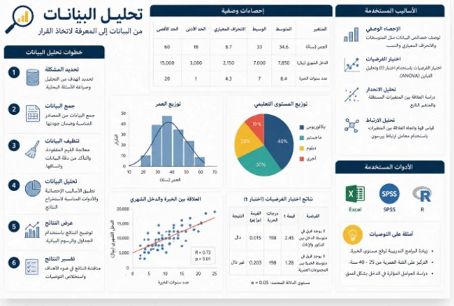
Presenting research methodology in slides should answer one clear question: How did the researcher move from the research question to the evidence? If the committee understands that journey, every procedural detail does not need to appear on the screen.
The methodology section can begin with the study design or methodological approach, followed by the population and sample or participants, instrument or data sources, procedures, and analysis. Where several stages are connected, a simple timeline or flowchart may communicate the method more effectively than six long bullet points.
In an experimental study, the presentation should show the group or groups, the measurement points, and how the intervention was implemented. In qualitative research, it should explain participant selection, data collection, and the analysis process. In survey research, it should briefly explain how the relevant variables were measured.
If validity, reliability, or methodological quality represents a critical part of the study, the most important indicator can be summarized in the main deck while the complete tables remain available in backup slides.
There is little value in listing many statistical tests if the audience does not understand why they were used. The more important point may be the relationship between the variable type, research question, and selected analytical method.
The methodology shown in the presentation must also match the final version of the research. If the number of participants changed after exclusions or an analysis method changed during final revisions, the slide needs to be updated accordingly.
-
Methodology should be presented as a journey from the research question to the data and then to the analysis so the audience understands where the findings came from before seeing them
-
Methodological details that demonstrate research quality should be summarized in the main presentation while full information remains available in backup slides where needed
-
Sample figures instruments and analytical procedures should be checked against the final research version so there is no contradiction between the presentation and the written study
Turning an Academic Study into a Presentation
Turning an academic study into a presentation means changing the communication medium without changing the evidence. Written research depends on pages, paragraphs, footnotes, and references, while a presentation depends on the researcher’s voice, slide sequence, and visual elements.
For this reason, not every part of the research should be forced into the same format. Some ideas remain text. Some work better as diagrams. Some need tables. Others may need no visual element beyond a clear title.
The conversion also requires understanding the audience. A presentation to specialists in the same field may use more advanced terminology than one presented to a multidisciplinary audience. However, during a defense the content should never be simplified to the point that scientific terminology becomes inaccurate.
References should also be handled intelligently. A full bibliography does not need to appear at the bottom of every slide, but concise citation should remain where an external fact, framework, or model requires attribution.
Tables and charts should maintain visual integrity. A chart axis should not be manipulated simply to make a small difference appear larger. Colors should not make one group look clearly superior when the data do not support that conclusion.
Any image or diagram taken from an external source should also be handled according to academic use and source rights rather than assuming that anything available online can be used freely.
-
Moving from research to presentation changes the way information is communicated but does not justify changing the strength of the evidence or removing limitations that affect interpretation
-
The audience influences the level of visual and verbal explanation but essential scientific terminology should remain accurate and should not be replaced with misleading simplified expressions
-
Charts and tables should maintain visual integrity so they clarify the data instead of exaggerating differences or creating an impression stronger than the actual finding
Designing a Scientific Research Summary
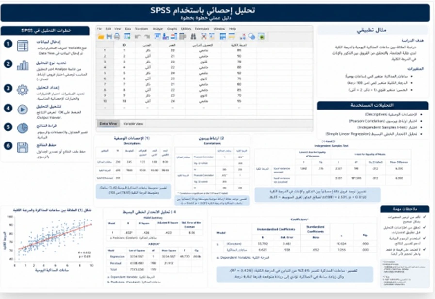
Designing a scientific research summary involves creating a fast layer of information that allows a reader or listener to understand the core of the study within a few minutes. This is different from designing the entire thesis because the summary selects only the essential information and organizes it into one coherent visual system.
A research summary usually needs a clear title followed by the problem or objective, core methodology, most important finding, and final conclusion. If the study contains several major findings, multiple cards or charts may be more effective than one large paragraph.
However, an infographic should not be used where the information is so complex that visual simplification hides important conditions. In some cases, a small table may be more accurate than a highly simplified illustration.
Numerical accuracy is particularly important in a research summary. Any percentage, mean, or other large figure immediately attracts attention and should therefore be checked twice before final delivery.
The distinction between the finding and its interpretation must also remain clear. A number represents what the study found. The explanation of why that number appeared belongs to the discussion.
A research summary can take the form of one presentation slide, several introductory slides, or a separate visual document depending on its purpose. Each form requires a different information density.
-
A visual research summary should focus on the problem methodology and major findings instead of trying to convert every research section into a miniature version
-
Prominent figures should be checked independently because they attract the most attention and any error can damage confidence in the complete presentation
-
Findings should be separated from their interpretation so the audience can distinguish between what came directly from the data and what represents the researcher’s explanation of those data
Organizing Thesis Content for a Presentation
Organizing thesis content for a presentation is the stage that brings all the previous steps together. Once the right content has been selected, it needs to be arranged in a rhythm that prevents one section from receiving far more time than it deserves.
The beginning should be short and focused on the problem. Questions and objectives follow. The methodology receives enough space to establish how the findings were produced. Results and discussion should receive the largest share of time where the nature of the study allows it. The conclusion then summarizes the contribution, limitations, and recommendations.
It is useful to build one central message for each slide. If the researcher cannot summarize what a slide says in one sentence, the slide probably contains more than one major idea.
Transitions are also needed between sections. The end of the research problem leads into the research question. The end of the methodology leads into the findings. The findings lead into interpretation. These verbal connections make the presentation feel like one complete study rather than a set of disconnected files.
Timed rehearsal is also important. If the researcher consistently spends too long on the background, the solution is not to speak faster but to reduce the background. If the results are always rushed, time needs to be redistributed.
The final version should be checked for several forms of consistency: the title and objectives should match the thesis, sample figures should match, findings should match, and recommendations should correspond to the final written version.
-
Each slide should communicate one central message so the audience immediately knows what information should be retained before moving to the next part
-
Presentation time should be distributed according to the scientific importance of each section rather than giving equal time to every chapter because written research and oral presentation have different needs
-
Final review should compare the slides with the latest version of the thesis so no outdated finding figure or recommendation remains from an earlier draft
Conclusion
Turning scientific research into a concise PowerPoint presentation for a defense succeeds when summarization is understood not as removing the greatest possible number of words but as rebuilding the research into a faster pathway that preserves its scientific logic.
Written research has enough space to explain definitions, previous studies, methodology, tables, appendices, and references in detail. A presentation does not have the same space. The researcher should therefore select only what the audience needs in order to understand the problem, question, method, result, interpretation, and limitations.
One of the biggest mistakes is treating every chapter equally. The background may need only one slide while the findings may need four. The objective is not equal distribution of pages but clarity of the scientific argument.
Scientific integrity should be maintained throughout the process. The strength of a result should not be exaggerated to make it more interesting. An important limitation should not be removed simply to make the slide shorter. A scientific term should not be changed merely because another expression seems easier.
In the end, a strong presentation should pass a simple test: after a committee member sees the slides and listens to the researcher, can they explain what the problem was, how it was studied, what the most important finding was, and what limitations apply to that finding?
If the answer is yes, the research has not simply been shortened. It has been transformed into a presentation that can actually be understood and discussed.
Frequently Asked Questions
What does converting scientific research into PowerPoint mean?
It means rebuilding the research content into concise slides that explain the problem, methodology, findings, and conclusions without copying entire chapters.
Is it enough to copy the research abstract into the slides?
No. The abstract is written for continuous reading, while a presentation requires information to be distributed according to the sequence of explanation.
Where should I begin when converting research into a presentation?
Begin with the research problem, questions, methodology, and findings before thinking about the template or colors.
Does every chapter need to become one slide?
No. Some chapters may need more than one slide while others can be summarized in one slide or less depending on their importance to the presentation.
How many slides does a scientific research presentation need?
There is no fixed number because the appropriate slide count depends on presentation time, study design, and the amount of important findings.
Should previous studies appear in the presentation?
Yes, to the extent that they clarify the research gap, but there is no need to present every previous study separately.
How should I summarize previous studies?
Extract the main areas of agreement, disagreement, and the research gap that led to the current study instead of listing studies one by one.
Should I include the complete theoretical framework?
No. Include only the concepts and theoretical model needed to understand the research question and findings.
How can I shorten the research problem?
Explain the context, then the specific problem, then the gap that justifies the study, and finally move to the main research question.
Should all study objectives be presented?
The main objectives should be presented fully where they are essential for understanding the findings and can be organized visually without changing their meaning.
How should hypotheses be presented?
They can be organized concisely and later linked directly to their corresponding results so the sequence remains clear.
Should definitions of terms be included?
Only include terms the audience needs in order to understand the research or terms with important operational definitions.
How can methodology be presented without long text?
Use a clear sequence showing the research design, sample, instrument, procedure, and analysis.
Should validity and reliability details be included?
Present the major indicators where they are important to research quality and keep the complete details in backup slides.
Should all sample characteristics be shown?
Include the characteristics that affect interpretation of the findings or are necessary for understanding the study design.
Should statistical software output be included?
Not in its raw form. Extract the indicators needed to understand the result.
How should research results be organized?
The clearest approach is usually to organize them according to the research questions or hypotheses.
Should the research question appear before the result?
This can be very helpful because it immediately tells the committee what the slide is answering.
Does every result need a chart?
No. Some findings are clearer in a table, a highlighted figure, or a concise sentence.
Is a chart better than a table?
A chart is often better for showing a trend or comparison, while a table is better where precise values are important.
Should statistically non-significant results be removed?
No if they answer the study questions because they remain part of the research findings.
How should qualitative findings be presented?
Present the main themes and related elements and use short data examples where appropriate while protecting participant identity.
How should a mixed-methods study be presented?
Present the findings from each component and then explain how the quantitative and qualitative results converge or explain one another.
Should discussion appear together with the results?
That depends on the presentation structure. Each result can be discussed immediately after it appears or a separate discussion section can follow the findings.
How should the discussion be summarized?
Focus on what the finding means, why it may have appeared, how it relates to previous studies, and the limits of its interpretation.
Should every study that agrees with the result be mentioned?
No. Select only the most important comparisons that genuinely help explain the finding.
Should the limitations of the study be included?
Yes. Limitations explain the real scope within which the conclusions can be applied.
Do limitations weaken the presentation?
No. Presenting limitations scientifically shows that the researcher understands both the strength and the boundaries of the study.
Should every recommendation appear?
Select the recommendations most closely connected to the findings and most relevant to the audience or field.
How can I make sure recommendations are supported by the study?
Review every recommendation and identify the research finding that supports it. If no clear finding supports it, reconsider whether it belongs in the presentation.
Should references be included?
Brief citations should be used where necessary while the complete reference list remains in the thesis.
Can I use images from the internet?
The source, usage rights, and academic context of the image should be considered before using it.
Are screenshots of thesis tables suitable for slides?
Usually not because they are often too small and crowded. It is better to redesign the most important part of the table.
Can I change the colors of charts from the thesis?
Yes to improve readability as long as the values remain unchanged and the visual design does not create a misleading impression of the differences.
How do I know whether a slide contains too much text?
If you need to read it word for word, reduce the font significantly, or explain where the audience should look, the slide is probably overcrowded.
Are bullet points better than paragraphs?
Usually yes in presentations, but the bullets themselves should still be carefully selected and should not become ten long sentences on one slide.
Does every slide need an image?
No. A visual element should be used when it improves understanding rather than simply filling empty space.
How should I choose a slide title?
The title should be direct and can communicate the main message of the slide instead of relying only on generic section names.
What are backup slides?
They are slides placed after the main presentation containing additional details such as complete tables, analyses, and instrument properties for use during questions.
Do backup slides count toward presentation time?
Not if they are excluded from the main sequence and used only when needed during discussion.
Should technical details be removed because of time?
They can be removed from the main sequence if they are not necessary for understanding, but the researcher should still understand them and be prepared to explain them.
Does summarization make the presentation less scientific?
No. A concise presentation can be scientifically stronger when it preserves the evidence and key relationships while removing repetition.
What is the difference between summarizing and simplifying research?
Summarizing reduces the amount of content while preserving meaning, whereas simplification changes the way the material is explained and can become problematic if it changes the scientific concept.
How can I avoid changing the meaning of the research while shortening it?
Check every claim in the presentation against the original text and the finding that supports it.
Can I say the research proved something if the study is correlational?
Not if the methodology does not support a causal conclusion. The wording should reflect the actual type of evidence.
Does the presentation need to match the thesis word for word?
The meaning, numbers, and findings must match, but the wording and visual presentation can be shorter and more natural for oral explanation.
How should I review the presentation before the defense?
Compare the title, research questions, sample, instrument, findings, figures, and recommendations with the final version of the research.
Should I rehearse after summarizing the presentation?
Yes. Rehearsal reveals sections that are still too long or need a stronger transition or clearer explanation.
What should I do if the presentation exceeds the allocated time?
Remove repetition and secondary background detail before cutting essential methodology or major findings.
How do I know whether the research summary is successful?
If the audience can understand the problem, research method, findings, and limitations without reading the complete thesis, the summary has achieved its purpose.
What should I send to a service that converts research into PowerPoint?
Send the final research document, presentation duration, university instructions if available, any supervisor comments, and clarify whether you need content summarization only or both summarization and complete slide design.
Need Help?
Contact us directly via WhatsApp and we will reply as soon as possible.
More Articles
Urgent PowerPoint Design in 24 Hours for University or Work
Urgent PowerPoint design within 24 hours for university or work, with clear structure, polished slides, accurate content, and presentation-ready delivery.
Read Article → Statistical AnalysisPowerPoint Design Prices in Saudi Arabia by Slide Count
PowerPoint design prices in Saudi Arabia by slide count, with key cost factors, custom design options, and clear guidance to choose the right service.
Read Article → University ResearchGraduation Project PowerPoint Design with Content and Results
Graduation project PowerPoint design with organized content, clear results, objectives, implementation, and polished academic flow for university review.
Read Article →