
Professional Project Dashboard Design in Spreadsheets
Professional project dashboard design with KPIs, charts, filters, interactive reports, and visual tracking to monitor results, progress, and project performance.
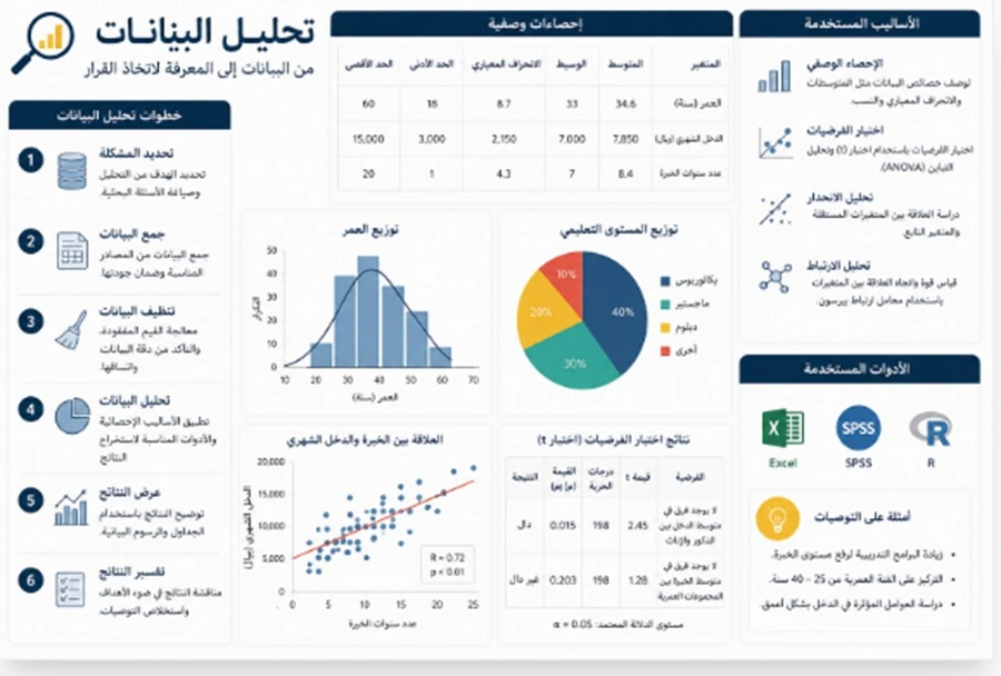
Professional Project Dashboard Design in Spreadsheets
Professional project dashboard design in spreadsheets helps transform dozens or even hundreds of rows and figures into one organized screen that highlights the most important information about the project: completion rate, delayed tasks, expenses, outputs, results, comparisons, and time periods. A strong dashboard does not display every value stored in the dataset. Instead, it selects the indicators that are directly connected to the project objectives and presents them visually so they can be understood quickly. Interactive dashboards can be built using summary tables, charts, filters, formulas, and visual organization so that the indicators update when the underlying data change rather than requiring the entire report to be rebuilt. Effective dashboard design therefore begins with understanding the project and its intended users, then selecting performance indicators, organizing the data source, and finally creating a clear, connected, and updateable dashboard.
Project Dashboard Design
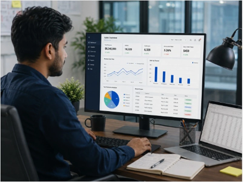
Project dashboard design begins before choosing colors, icons, or chart styles.
The first question should be: What decisions should this dashboard help the user make?
For a university project, a student may need to track:
-
Percentage of tasks completed
-
Number of completed activities
-
Delayed activities
-
Remaining time
-
Distribution of responsibilities
-
Expenses compared with budget
-
Number of beneficiaries or participants
-
Survey or evaluation results
-
Progress in each project phase
-
Outputs that have already been delivered
A commercial or administrative project may require a completely different set of indicators.
This means the same dashboard design should not be applied to every project.
The dashboard should begin with the academic, operational, or managerial questions that need answers, and the required data should then be identified for every question.
For example, if the objective is to monitor compliance with the project schedule, the dataset may need to include:
-
Start date
-
Planned completion date
-
Actual completion date
-
Task status
-
Percentage of completion
These fields can then be used to build indicators or charts that explain the current project status.
However, if the original data do not contain the information required for a particular KPI, it is not appropriate to create a precise-looking indicator without a genuine data source.
The intended user should also be identified.
Will the dashboard be used only by the student?
Will it be presented to the project supervisor?
Will an entire team use it?
Will it be printed, or will it be used interactively?
These decisions influence the amount of information, the level of interaction, and the amount of detail that should appear.
-
Dashboard design should begin with the decisions and questions it needs to support.
-
Every indicator should have a clear and reliable data source.
-
Dashboard structure should change according to the user and the purpose of the project.
KPI Monitoring Dashboard
A KPI monitoring dashboard should focus on a limited number of meaningful figures rather than displaying everything in the database.
A useful performance indicator should be connected to a specific objective.
If the project target is to complete 100 cases during a defined period, the number of completed cases becomes a meaningful KPI.
The dashboard can also show:
Current Value:
For example, 72 completed cases.
Target:
100 cases.
Completion Rate:
72%.
Gap to Target:
28 cases remaining.
Trend:
Is performance improving or declining compared with the previous period?
Displaying the target makes the number much easier to understand.
Writing “72 cases completed” provides less information than showing that the target is 100 and the project has reached 72% of its goal.
Conditional formatting can also be used to display performance status visually, but every color should represent a defined meaning.
For example:
-
Green = on track
-
Yellow = needs attention
-
Red = behind the defined threshold
However, the thresholds themselves should be based on project objectives rather than selected simply because the colors look appropriate.
Professional KPI design means defining what good, acceptable, and delayed performance actually mean before coloring the dashboard.
-
Every KPI should be connected to a target, benchmark, or interpretable criterion.
-
A current value becomes more useful when it is displayed with a target, gap, and trend.
-
Colors should communicate performance status rather than serve as decoration.
Interactive Project Report Design
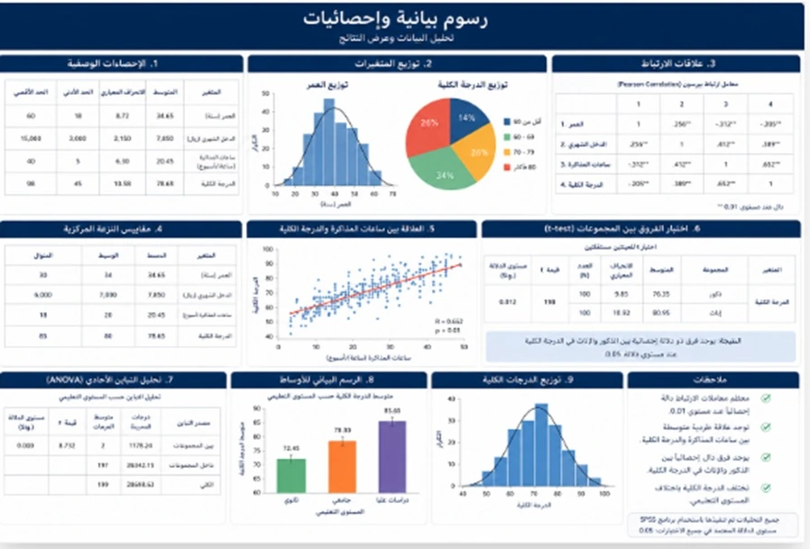
Interactive project report design allows the user to change the reporting perspective without creating a new report every time.
For example, the dashboard may include filters for:
-
Month
-
Project phase
-
Team member
-
Activity type
-
Department
-
Region
-
Task status
-
Beneficiary category
If the user selects October, the related tables and charts can display October data only.
If the user selects one team member, the dashboard can show that person’s assigned tasks and results.
Spreadsheet tools such as Slicers can be used to filter PivotTables and related charts, while a Timeline can make date-based filtering easier when project data include suitable dates.
However, interactivity does not mean adding twenty filters to the page.
Too many controls make the user spend more time deciding what to click than understanding the project.
It is better to select only the filters that genuinely change the decision or interpretation.
For example, a university project dashboard may only need:
-
Period
-
Task type
-
Task status
That may be enough.
The dashboard should also be tested after every filter is applied.
Some charts may become empty or some indicators may produce misleading values when the selected category contains very little data.
The formulas, charts, and summary tables should therefore be checked across different filter combinations.
-
Interactive reports allow the same dataset to be viewed from several useful perspectives.
-
Filters should be selected according to user decisions rather than the number of available columns.
-
Every filtering scenario should be tested before the dashboard is delivered.
Visualizing Project Data
Visualizing project data requires selecting the right chart for the message being communicated.
Not every number needs a pie chart.
Not every comparison needs a complicated visualization.
The objective is to help the user understand the information faster than they would by reading a raw table.
A useful guide is:
If there are fifteen categories, a pie chart is usually difficult to read.
A sorted bar chart may provide a much clearer comparison.
If the purpose is to understand monthly trends, a line chart is more useful than a collection of separate KPI cards.
PivotCharts can be especially useful for representing summarized project data visually because they can update when the underlying PivotTable changes or when related filters are applied.
Chart titles also matter.
Instead of a generic title such as “Chart 1,” use:
Task Completion Rate by Project Phase
The title should tell the user what the chart is intended to show.
-
The chart type should be selected according to the question being answered.
-
More charts do not automatically make a dashboard more professional.
-
Every chart title should communicate its purpose without requiring the user to guess.
Project Results Monitoring Dashboard
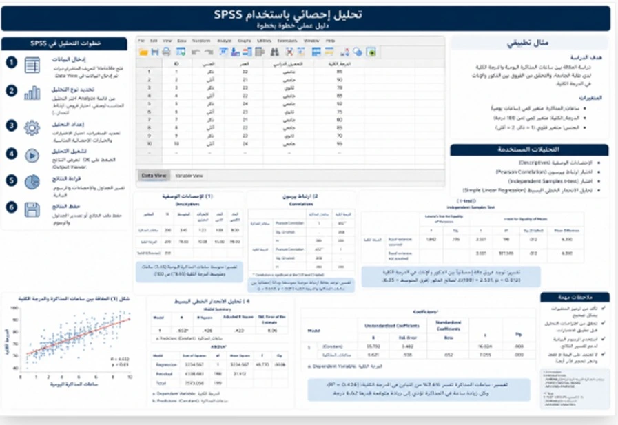
A project results monitoring dashboard is different from a dashboard that only tracks activities.
An activity describes what was done.
A result describes what was achieved or what changed as a consequence of the project, where that change has actually been measured.
For example:
Activity: Eight workshops were delivered.
Output: 160 students received training.
Result: The average skill assessment increased from one measured value to another, if the project collected valid data to assess that change.
This distinction is especially important in university projects.
Students may fill a dashboard with meetings, tasks, and activities while overlooking the actual project results.
A stronger dashboard can therefore separate information into different levels.
Implementation
-
Number of tasks
-
Completion rate
-
Delayed tasks
-
Completed tasks
Resources
-
Budget
-
Expenditure
-
Time
-
Number of participants
Outputs
-
Number of completed products or activities
-
Number of beneficiaries
-
Number of reports or materials delivered
Results
-
Final performance indicators
-
User evaluation
-
Change in the target indicator
-
Output quality where a valid measurement method exists
However, results should never be invented when the data do not support them.
If the project measures only activities, they should be presented clearly as activities rather than being renamed as “impact” or “results” without actual measurement.
-
Activities, outputs, and results should be clearly distinguished.
-
A result should be supported by actual project measurement.
-
A strong monitoring dashboard presents implementation, resources, outputs, and results in understandable layers.
Professional KPI Design
Professional KPI design requires defining every KPI precisely so that it cannot be interpreted in several different ways.
For each indicator, it is useful to specify:
-
KPI name
-
Purpose
-
Calculation method
-
Data source
-
Update frequency
-
Current value
-
Target
-
Performance status
-
Person responsible for updating it when the project is collaborative
For example, the KPI:
Percentage of Completed Tasks
may be calculated as:
Number of completed tasks ÷ Total number of tasks × 100
However, the team still needs to define what “completed” means.
Is a task considered complete when it has been performed?
Only after it has been reviewed?
Or only after supervisor approval?
If the team does not agree on the definition, different people may calculate the same KPI differently.
Indicators that look impressive but do not support any real decision should also be avoided.
For example, displaying the “total number of rows in the database” is not necessarily useful unless that number directly relates to project performance.
The top of the dashboard should not be crowded with ten large KPI cards.
A limited number of primary indicators can provide the overall picture, while charts and detailed tables below them can provide supporting information.
-
Every KPI should have a definition, formula, and identifiable data source.
-
A smaller number of clear KPIs is more useful than dozens of unrelated figures.
-
The calculation method should remain consistent across updates so performance comparisons remain valid.
Administrative Data Report
An administrative data report transforms figures into information that can be used in a meeting, presentation, or project review.
The dashboard itself provides the quick overview.
The administrative report may add:
-
Period summary
-
Main achievements
-
Delayed indicators
-
Recorded causes of delay
-
Decisions required
-
Next priorities
-
Notes about the data
-
Comparison with the previous plan
This is where avoiding raw-data overload becomes important.
If the dataset contains 2,000 rows, a supervisor or manager does not need to see all 2,000 rows on the first screen.
They first need answers to questions such as:
What happened?
Where is the problem?
Is the project on track?
What requires a decision?
Detailed records can then remain available in a separate worksheet.
A practical workbook can therefore contain:
Data:
The main source data.
Calculations:
Intermediate calculations and summary tables.
Dashboard:
The main visual interface.
Details:
Records available for further review.
Dictionary or Notes:
Explanation of indicators, definitions, and data sources.
This separation reduces unnecessary clutter in the dashboard.
-
Administrative reporting focuses on information that supports monitoring and decision-making.
-
The detailed database does not need to appear entirely on the main dashboard page.
-
Dividing the workbook into functional worksheets makes updating and reviewing easier.
Project Data Analysis Dashboard
A project data analysis dashboard combines description, comparison, and trends to help the student or project team understand performance rather than simply monitor it.
The dashboard may answer questions such as:
-
Which project phase has the greatest delay?
-
Which activity type consumes the largest share of the budget?
-
During which periods did progress increase?
-
Is the number of completed tasks improving weekly?
-
Which category received the highest evaluation?
-
Does one region require greater intervention?
-
Is expenditure progressing consistently with project completion?
These questions determine what analysis should appear.
PivotTables can summarize large quantities of data efficiently and allow the fields to be rearranged so the same dataset can be examined from several perspectives.
PivotCharts can then display comparisons, patterns, and trends visually.
However, the project dashboard should not be turned into an advanced statistical analysis exercise without a real need.
If the purpose is operational project tracking, totals, percentages, averages, comparisons, and trends may be sufficient.
If the research project requires hypothesis testing or advanced statistical models, those analyses can be conducted separately and only the most important results can be incorporated into the dashboard where appropriate.
-
Analysis inside the dashboard should focus on questions that help users understand project performance.
-
PivotTables are useful for summarizing data and changing the perspective from which it is viewed.
-
Advanced analysis should be included only when it serves an actual project question.
KPI Chart Design
KPI chart design should prioritize clarity before visual decoration.
A successful chart should communicate its message within seconds.
Several design elements deserve attention.
Number of Colors
Using a different color for every category can distract from the message.
A consistent visual system is usually more effective.
Axes
Some charts should begin at zero so that small differences are not visually exaggerated.
In other cases, a different axis range may be appropriate, but the visual should never distort the meaning.
Labels
It is not necessary to place a data label on every point if the chart becomes crowded.
Only the information needed for interpretation should be displayed.
Three-Dimensional Charts
Three-dimensional effects can make sizes and comparisons more difficult to judge accurately.
Simple two-dimensional charts are therefore often clearer for performance monitoring.
Time-Based Charts
Time data should normally follow chronological order.
January should be followed by February and March when the objective is to track a trend, rather than sorting months from highest to lowest.
Target lines and actual-versus-planned comparisons can also be used instead of displaying disconnected figures.
The visual should answer quickly:
Are we above or below target?
Is performance improving or declining?
-
Visual design should preserve the accuracy of the message.
-
Similar indicators should follow a consistent visual language and color system.
-
Decorative elements that do not improve understanding should be removed.
Tracking Project Figures in One Dashboard
Tracking project figures in one dashboard means bringing the most important project indicators together in a single interface so the user does not need to open ten worksheets to understand current performance.
The top of the dashboard might include:
-
Completion percentage
-
Number of completed tasks
-
Number of overdue tasks
-
Expenditure compared with budget
-
Number of beneficiaries
The middle section might contain:
-
Progress trend over time
-
Task distribution by status
-
Comparison between project phases
-
Budget distribution
The lower section could include:
-
Short table of critical tasks
-
Last update date
-
Important notes
-
Report filters
This structure moves from the general overview toward more detailed information.
However, “one dashboard” does not mean that every available detail must fit on one screen.
Supporting worksheets or pages can be created when additional information is needed.
The main dashboard should function as a decision interface, not as a miniature copy of the raw database.
When PivotTables and PivotCharts are connected to filters, users can move from an overall view to a selected category or period without creating a completely new dashboard for every scenario.
-
The main dashboard should begin with the overall picture and then allow users to move into details.
-
Every area of the screen should answer a question or support a decision.
-
Large detailed tables should remain on supporting sheets instead of overcrowding the main page.
What Is the Difference Between a Dashboard and a Regular Report?
A regular report may include fixed tables and charts presenting a specific period or set of results.
A dashboard is usually designed for repeated monitoring and may include interactive filtering and updating.
A project may need both.
The dashboard supports quick monitoring, while a detailed report explains the results more fully.
How Do We Choose Project Performance Indicators?
Before adding any KPI, ask:
-
What is the objective of the project?
-
What result must be achieved?
-
How will we know whether progress is being made?
-
Do we actually have data to measure it?
-
Does the indicator change over time?
-
Can the user make a decision based on it?
-
Does it have a target or benchmark?
-
Is the calculation method clear?
If an indicator does not help support any decision, it probably does not deserve a major position on the main dashboard.
For example, if a graduation project aims to develop a platform within twelve weeks, indicators such as:
-
Percentage of development phases completed
-
Number of overdue critical tasks
-
Number of completed tests
-
Number of open issues
-
Progress against the project plan
may be more useful than the number of meetings alone.
How Should Data Be Prepared Before Dashboard Design?
A dashboard cannot automatically repair a disorganized database.
Before dashboard development, the source data should be structured properly.
Ideally:
-
Every row represents one record.
-
Every column represents one variable.
-
Column headers are clear.
-
Dates are stored as dates.
-
Numbers are stored as numbers.
-
Category names are consistent.
-
Missing values are understood.
-
Merged cells are avoided within the data source.
-
Every KPI has a clear source.
If the dataset will be updated regularly, using a structured table rather than a fixed range can make expansion and updating easier where supported by the spreadsheet software.
Summary tables, formulas, and charts should then be built from the organized source rather than manually typing figures into the dashboard.
How Can a Dashboard Be Made Easy to Update?
The strongest dashboard is one that does not need to be rebuilt every time new data are added.
This can be supported through:
-
A data source with a consistent structure
-
Structured tables
-
Formulas linked to the source
-
PivotTables
-
PivotCharts
-
Slicers
-
Timeline controls
-
Expandable ranges or dynamic data sources where appropriate
-
Separation of source data from the presentation interface
When new records are added and the relevant tables are refreshed, the connected indicators should update rather than requiring the figures to be rewritten manually.
However, the updating process itself should be tested.
Did the new rows become part of the source?
Was the date entered in the correct format?
Did filters recognize new categories?
Are the calculated KPIs still correct?
An updateable dashboard still requires a controlled data structure.
Common Dashboard Design Mistakes
Some of the most common mistakes that reduce dashboard usefulness include:
-
Starting visual design before understanding the project
-
Displaying every available number
-
Selecting KPIs without clear objectives
-
Repeating the same information in several charts
-
Using too many colors
-
Using a pie chart for a large number of categories
-
Displaying indicators without targets or interpretation
-
Typing figures manually into the dashboard
-
Mixing data calculations and dashboard elements in an unorganized way
-
Failing to show the date of the latest update
-
Adding too many confusing filters
-
Choosing unsuitable chart types for comparisons
-
Depending on color alone to communicate status
-
Failing to test filters
-
Having charts that do not respond to filters even though users expect them to
-
Ignoring errors or missing values in the data source
-
Using unclear chart titles
-
Turning every number into a KPI
-
Overcrowding the page with details
-
Presenting a level of precision that the underlying data quality does not justify
A professional dashboard often looks simpler than a page filled with every available visual element because it includes only what the user actually needs.
How Should a Project Dashboard Be Arranged?
One practical layout could be:
Top Section
Main KPI cards:
-
Completion
-
Delays
-
Budget
-
Beneficiaries
-
One major outcome indicator
Middle Section
Main charts:
-
Time trend
-
Category comparison
-
Actual versus target
Side Section
Filters:
-
Period
-
Category
-
Project phase
Bottom Section
Details:
-
Critical cases table
-
Notes
-
Last update
This is only an example.
The final arrangement should depend on the project type, number of indicators, and display size.
Designing a Dashboard for a Supervisor or Project Committee
If the dashboard will be presented during a defense, review meeting, or supervisor discussion, information should be even easier to read.
A strong presentation version may include:
-
Clear project title
-
Data period
-
Four to six primary indicators rather than dozens of KPI cards
-
One or two charts showing the most important project trends
-
Clear comparison with targets
-
Results rather than detailed calculation steps
-
A separate worksheet containing detailed information for questions
The supervisor usually wants to understand:
Where is the project now?
What has been achieved?
What remains incomplete?
Do the results support the project objective?
For this reason, a presentation dashboard should not look exactly like the working data sheet used during project implementation.
Why Choose Rukn for Project Dashboard Design?
At Rukn Translation and Educational Services, dashboard work can be adapted to the actual condition and purpose of the project rather than applying one fixed template to every dataset.
Depending on the project, the work may begin with:
-
Organizing the data file
-
Reviewing required indicators
-
Building calculations
-
Preparing PivotTables
-
Designing charts
-
Creating KPI cards
-
Adding filters
-
Arranging the dashboard interface
-
Preparing a detailed data page
-
Reviewing the updating method
-
Simplifying the dashboard for a presentation or defense
The value does not come from the number of colors or charts.
The practical value is that the user can open the file and understand the project status without reading hundreds of raw rows.
A dashboard also should not be presented as something that automatically improves the academic quality of a project.
Dashboard quality depends on data quality, KPI selection, and how closely those indicators relate to the actual project objectives.
Steps for Professional Project Dashboard Design
The work can be organized through the following process:
-
Receive the project file and current data.
-
Understand the project objective and the audience who will use the dashboard.
-
Identify the questions the dashboard must answer.
-
Select the primary performance indicators.
-
Define the calculation method for every KPI.
-
Review and organize the data source.
-
Standardize dates, categories, and data types.
-
Create an organized primary data worksheet.
-
Create summary tables or PivotTables where required.
-
Prepare the formulas and calculations used in the indicators.
-
Select the appropriate chart for every type of information.
-
Create the main KPI cards.
-
Add Slicers or appropriate filters where needed.
-
Add a Timeline when time-based analysis is appropriate.
-
Connect charts and tables to the required filters.
-
Design the visual layout from overview to detailed information.
-
Add targets and comparisons where actual targets are available.
-
Test interactions and updates after new data are added.
-
Verify displayed values against the original data.
-
Prepare the final version for ongoing monitoring or presentation to the supervisor.
Following these steps ensures that the appearance of the dashboard comes from understanding the project rather than from placing different numbers inside a generic template.
Project Dashboard Design Prices
There is no single fixed price for professional project dashboard design in spreadsheets because the workload varies depending on the data and level of interaction required.
Factors that can affect the scope include:
-
Number of data sources
-
Number of rows and variables
-
Current condition of the file
-
Need for data cleaning
-
Number of KPIs
-
Number of charts
-
Number of dashboard pages or worksheets
-
Need for PivotTables
-
Need for interactive filters
-
Presence of time-based analysis
-
Number of categories
-
Need for custom formulas
-
Availability of targets
-
Need to compare actual performance with planned performance
-
Frequency of data updates
-
Need for a details page
-
Level of visual design
-
Need to prepare the dashboard for a defense or presentation
-
Requested revisions
-
Delivery deadline
A simple dashboard containing five indicators and three charts built from a clean file is different from a dashboard connected to multiple worksheets and sources that requires filters, calculations, and several performance indicators.
For this reason, it is better to provide the current dataset, project objective, required indicators where already defined, targets where available, and any existing report template so the dashboard scope can be determined before pricing.
Frequently Asked Questions
What is the most important part of project dashboard design?
The most important step is selecting indicators that are directly connected to the project objectives. Attractive design cannot compensate for KPIs that do not help the user understand performance or make decisions.
Can the dashboard update when new data are added?
Yes, if the data source, tables, formulas, and charts are structured appropriately for updating. The exact update process depends on how the workbook and dashboard are built.
Do I need PivotTables in every dashboard?
No. PivotTables are extremely useful for summarizing data and building interactive reports, but some simple dashboards can be built using regular tables and formulas. The choice depends on the data structure and updating requirements.
How many KPIs should appear on the main dashboard page?
There is no universal number, but it is usually better to display a limited set of primary indicators that provide a quick overview of the project and place supporting details in charts or additional worksheets rather than overcrowding the main screen.
What should I send when requesting a project dashboard?
Send the current data file, a description of the project, the indicators you want to monitor if already defined, available targets, the current reporting format if one exists, and any supervisor or university requirements.
Conclusion
Successful professional project dashboard design in spreadsheets is not measured by the number of charts or the amount of visual decoration.
A strong dashboard begins with the objective of the project.
The decisions the user needs to make are then identified.
Those decisions guide the selection of performance indicators.
Each KPI should have a clear data source and a defined calculation method.
The data are then organized, and summary tables, formulas, charts, and filters are created.
The page should be arranged so the overall picture appears first, followed by trends, comparisons, and important details.
When the source data are updated, the dashboard should help the user understand the current status quickly instead of rebuilding the report manually every time.
The final goal is to track project figures in one clear, updateable dashboard that supports decision-making or presentation to a project supervisor.
If you already have a university project or dataset and want to convert it into a clear and interactive dashboard, prepare the current file, project objectives, available targets, and required indicators where already defined, then contact Rukn Translation and Educational Services to determine whether you need data organization only or a complete KPI dashboard including calculations, charts, filters, and a final monitoring interface.
Need Help?
Contact us directly via WhatsApp and we will reply as soon as possible.
More Articles
Online Saudi Math Tutor by School Stage and Curriculum
Online Saudi math tutoring tailored to the student’s school stage and level, from foundations and lesson explanation to problem solving and exam review.
Read Article → Statistical AnalysisStatistical Results Interpretation and Research Results Chapter Review
Statistical results interpretation and results chapter review with clear table explanations, significance reporting, research-question alignment, and accurate academic presentation.
Read Article → Data ProcessingResearch Data Cleaning in Spreadsheets Before Statistical Analysis
Research data cleaning before analysis, including missing values, duplicates, errors, outliers, spreadsheet organization, and accurate database preparation.
Read Article →